
I am a bit of an organisation freak. If what I’m working on isn’t properly organised, categorised, labelled, and so on, the odds are that I will freak out and shit just won’t get done.
I’ve always been like that, regardless of the size and/or scope of whatever project I was working on. Yes, in part it’s a bad case of pedantry, but as I learned fairly recently, sometimes you really need to meticulously organise your workflow, your tasks, and your data.
A little over a year ago, my job gradually became producing YouTube videos; I was (and I still am) responsible for every damn last thing: script researching & writing, filming, editing, publishing, sharing, you name it. I did (and I still do) have a small team of people helping out with some things, or taking care of specific tasks, but juggling all this stuff to make sure a video would get out the door when it was supposed to was up to me.
Welcome to the magical world of productivity tools, myself!

Well, okay, I wasn’t exactly new to it. For various reasons (including the fact that I’m drawn to a shiny new webtool like moths to the fire), I already had used productivity tools before.
My first one was WorkFlowy—basically a bulleted list on steroids—which I used for years before briefly switching to Dynalist—basically WorkFlowy on steroids. They’re cool and all, but a list of bullet points, however jacked up it may be, simply wouldn’t cut it for me (and it showed as I kept reorganising my lists over and over again in a futile attempt to find the perfect format). At some point I had a Trello account, too, but for some reason, after a few months of use I disliked it enough to feel relieved when I deleted my account. No hard feelings, Trello people.
When it came to youtubing, I decided it was time to find a tool better suited to my needs. So I sat down and googled the best options out there. After going through a jungle of apps all promising to turn my life on its head and myself into a machine to get stuff done, I finally came across the wet dream of every organisation freak like me: Notion.
What’s Notion?
Notion is an app by Notion Labs, a startup which went from nearly failing to being worth $2 billion in about four years. It’s a collaborative workspace that allows users to organise and manage their projects as granularly as they like.
In my case, Notion started off as a work tool and it turned into an everything tool—besides work, I use it to keep track of personal tasks, this very blog’s posts, the sci-fi novel series I’m working on (which one day I will talk about on this blog too), books I want to get, study notes, and more. This kind of stuff is my girlfriend’s nightmare (her battle cry is “Disorganised!”), but it’s pretty much my cup of tea.
Notion helped me organise my thoughts and re-ignite creative processes that had been stagnating for years; juggling multiple projects at a time had always been difficult and stressful for me, but ever since I started using Notion to bring order into chaos, I’ve been moving full speed ahead. Notion is the first webtool that I actually ended up buying a subscription for, and even now that it’s basically free (more on that later) I will still keep paying for it.
I’m kinda starting to sound like a paid ad, so let me say that, on its own, no tool will do miracles for you, Notion included. However, a tool that suits your working style and your personality may well help you get done more with less effort. (There are some pitfalls, at least in my case, which I will go into later…) Also, Notion is far from being the only collaborative workspace out there, and depending on what you like and what you need to do, it can be better or worse than other options.
Notion pages
Notion’s most basic element is a blank page, which you can fill with however many blocks you like. (Up until recently, Notion’s free plan allowed users to have a maximum of 1000 blocks per workspace; last May, that limitation was removed, effectively making Notion free to use.) A ‘block’ is many things—text boxes, check boxes, images, embedded media, bookmarks, pages and subpages, and even databases count as blocks. (I’ll go into databases later.)

A mock-up Notion page.
Pages have a title and can have icons and covers (but they don’t have to). Inside a page, you can place different blocks in virtually any way you like, for example to create a simple to-do list, like this one:

A simple, mock-up to-do list in Notion.
Notion’s claim to be an all-in-one workspace isn’t quite true yet, but it comes very close (and I do believe that Notion has the potential to eventually fulfil that promise). On the same page, you can have a calendar next to your to-do list; a checklist and a source list next to an essay; or a kanban board next to an embedded YouTube video (that’s weird, though).

By drag-and-dropping blocks next to each other, you can divide your Notion pages vertically.
The basic block arsenal offered by Notion allows you to create documents in your pages not unlike a Google Doc, though there are limitations. You can use headings of three different sizes, bulleted and numbered lists, emojis, 
Proper text alignment is one. Currently, everything is left-aligned by default and there’s no changing that in any way. I’m not sure how much other people care for it, but I prefer justified text, and anyway in some cases you might need centred or right-aligned text. Another minor issue I have with text in Notion is that while you can bold, italicise, underline, and strike-through it, there’s only a very limited number of colours you can choose from, and they’re all pretty dull. This doesn’t apply only to text, but also to highlights and database labels.

The colours available in Notion don’t look that dull when used for text, but they definitely do when used for labels or backgrounds. However, you can change both the font and background colour of text in Notion, and when you combine colours together, this can make them less dull.
In addition to hyperlinking your text, you can mention people (if they have access to your workspace) and dates in-line by typing ‘@’. People you mention will be notified, and reminders can be added to dates, which is especially useful for to-do lists and to keep track of deadlines. Other Notion pages can be mentioned too, but that’s essentially the same as adding a fancier-looking hyperlink.

This is what mentions and the mention menu look like.
Notion databases
In Notion, databases can be added as blocks to existing pages, or can exist on their own, essentially as the only element of a page to which nothing else can be added. Databases allow you to structure and visualise your data in a logical, consistent way. You can create as many views as you like for any given database, though at the moment there are only five types of views: table, board, calendar, list, and gallery. (It looks like a timeline view may be in the works.)
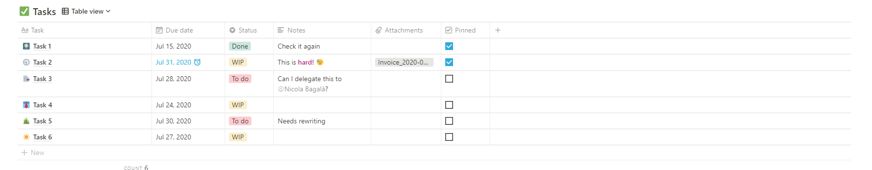
Notion’s table view of an example database.

Notion’s calendar view of the same example database as above.
Personally, I use mostly the table and calendar views; I never quite got the point of the gallery view and I find the list view only marginally useful. I can see how a board view may be very useful, but for some reason I almost never use it.

Notion’s board view. Probably more useful for much larger projects than mine, with far more people working on them .
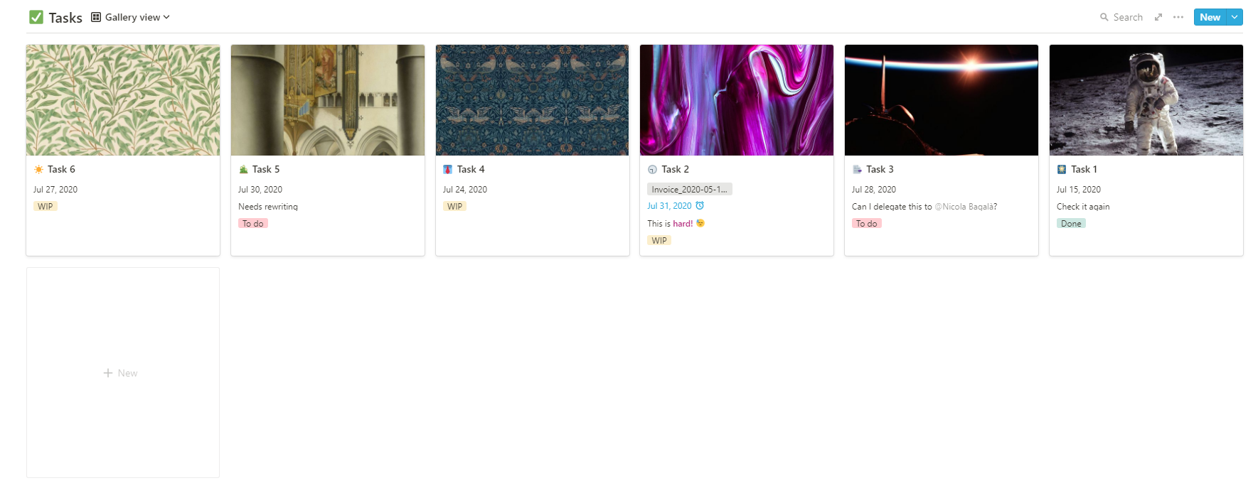
Notion’s gallery view.

Notion’s list view. I don’t quite see the point of all the white space and cramming properties all the way to the right like that.
Apart from letting you visualise the same data in different ways (for example, sorting your tasks by priority into a list, or by date into a calendar), database views in Notion allow you to quickly filter your data. For example, you can make a view that only shows tasks due today and one that only shows tasks due tomorrow. In practice, this can be accomplished by two identical views, except that they have two different filters hiding tasks that don’t match the specified conditions.

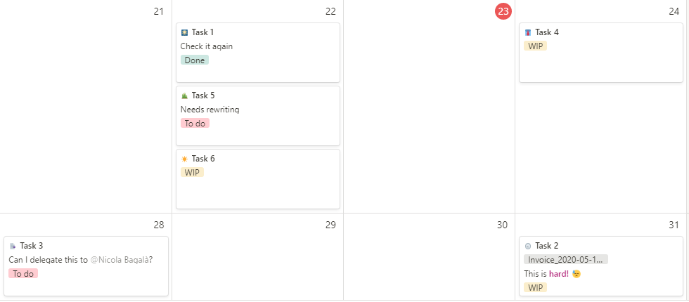
This is my actual task list. This view filters out anything that’s not scheduled for today or that doesn’t recur on the current day of the week.

Same as above, except for tomorrow.
As a side note, Notion filters recently got an upgrade. Until early this year, you could use only either of two logical operators to combine filters, AND or OR. This issue was solved with the introduction of nested filters, which allow you to combine multiple logical operators up to three nested levels.
For example, say you wanted a table view that showed all tasks with due date today assigned to Bob or Mike. This boils down to a filter where the field “Assignee” is “Bob” OR “Mike, AND “Due date” is “Today”. Before nested filters were implemented, you couldn’t do that; all your filters had to be combined either with OR or with AND. Now you can nest this filter like this: (“Assignee” is “Bob” OR “Assignee” is “Mike”) AND “Due date” is “Today”.
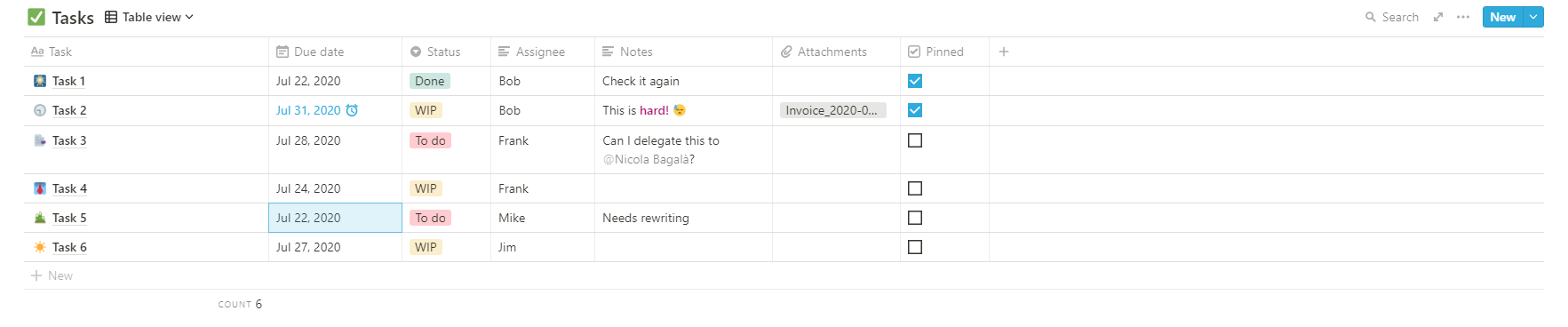
An example task list without filters.
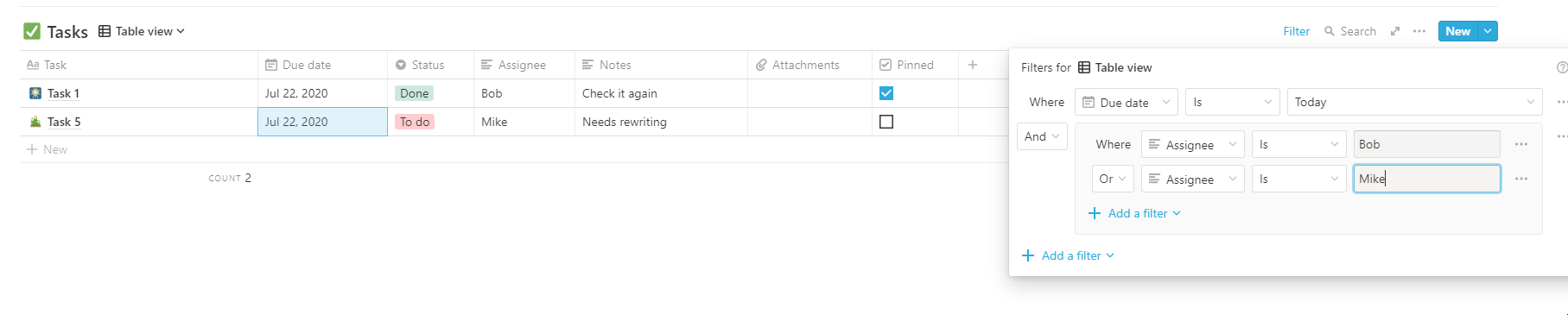
The same task list with nested filters that only show tasks assigned to Mike or Bob due today. (The “Assignee” field is of type text rather than person in this example because it was easier this way. In real life, you’d use a person type field.)
Databases can have as many fields as you like. Basic fields include things like text, numbers, dropdowns, dates, URL, workspace members, files, etc. More advanced fields keep track of when or by who a database item was created or changed, allow you to relate databases to each other, or to code your own custom formulas.
Formulas can be useful for simple things, like summing together values from two other fields, but also to program workarounds for features that Notion Labs hasn’t implemented yet, such as recurring tasks. At the time of writing, Notion simply doesn’t offer an option to create a task that recurs every Monday, for example. The way I do it is by having a “Recurs every” field where I specify on which days of the week the task recurs on, and a formula field that checks if “Recurs every” contains today’s name of the day.
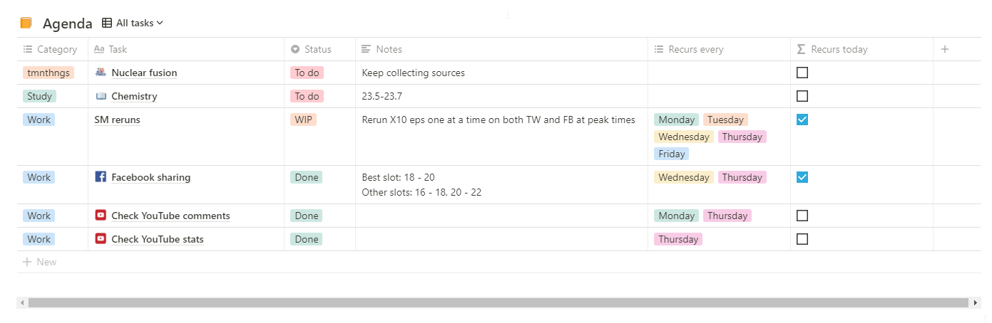
My task list, showing which tasks recur on which days.
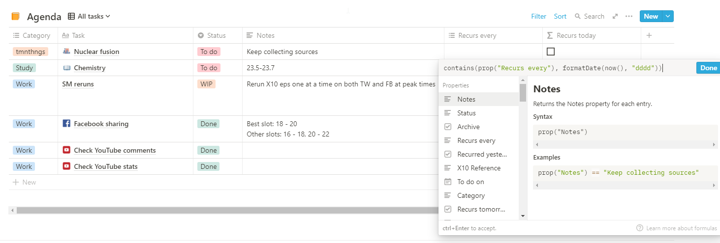
The formula I use for the “Recurs today” field. Only tasks where “Recurs today” is true (i.e, the box is ticked) are shown in that view.
There’s a bunch of examples to be made, functions to talk about, and use cases worth mentioning, but then again, this is not a full guide to Notion, so I am not going to go into every last detail.
Workspaces, sharing, and customisation
When you open a Notion account, you start off with a single workspace, but you can create many. I don’t quite need to organise my stuff in such a granular way, but if you like to have a separate workspace for work and one for your personal things, or for your finances, you can.
Workspaces have a members’ area to which all people in the workspace have access, and also a private area to which only the workspace owner has access. You can also share individual pages, even with people who don’t have a Notion account, and if you like, with the entire world: there’s an option to make your pages accessible to anyone at all.
Even though Notion is essentially free these days, it does have paid plans that come with extra features, such as the ability to add more guests or members, or version history. Thanks to version history, I was able to recover more than one page that had accidentally ended up in the bin, and that’s one of the reasons I will stick to the Personal Pro paid plan: the Personal plan, which is free, doesn’t come with version history. (I also want to support Notion Labs because I like their work.)
This is a good moment to mention one of the features I’d like to see: a page protection option to prevent accidental deletion. Notion pages do have a page lock option that prevent from accidentally modifying the contents of the page, but this doesn’t prevent you from deleting the page along with its locked contents. If it had existed, this feature would have spared me scavenging for my pages from the trash.
In terms of customisation, Notion doesn’t quite shine. It does come with its own emojis, and you can add covers and icons to pages, but there isn’t much choice when it comes to font family and size. The app comes in a light and a dark mode, but you can’t change the background colour of your pages. (These limitations aren’t necessarily bad, as I’d probably spend far too much time customising every single detail if I was given the option.)
Can Notion get better? Yes.
Notion has a lot of good things about it. Besides the features of the app itself, I like the fact that the developers are very responsive and listen to the wishes of their community: two features that I really wanted (nested filters and inline LaTeX) were implemented this year—not because of me, since I didn’t ask, but because many in the user base asked for them. I periodically visit Notion Labs’ What’s new page, and I find new updates two-three times per month. Also, Notion’s user base has formed several communities where you can find help or look for templates to use in your own workspaces. The communities even organise Notion events, which I found a bit surprising—maybe it’s a common thing that happens for more apps than I imagine, but I wasn’t expecting it.
That being said, can Notion get better? Why, yes. Aside the few missing features I mentioned above, there’s a ton of other things that the app could benefit from, at least some of which are already implemented by different competitor apps. I will admit to having been tempted to switch from Notion to other tools (such as Coda.io) because of this, but I decided not to. I find that other tools offer less freedom in terms of workspace organisation, or are too complex although attractive at first (I’m looking at you, Zenkit). Not to mention the hassle of moving everything from Notion to another app.
Here’s my Notion feature wish list, more or less ordered by how badly I want the feature (sometimes it’s hard to decide).
1. Mind maps
For some things, like planning a novel or a lengthy article, mind maps are really useful. Notion doesn’t have a mind map view for databases (and I’m not sure if their database architecture would even allow to implement it), so I have a separate paid tool for that, which I’m not crazy about, but it was the best bang for the buck I could find. I may have already found a good replacement for it, and I’ll get it when my current mind map tool’s subscription expires—unless Notion manages to add mind maps before then. 🙂
2. Recurring tasks/reminders
While you can add a date to a database, or anywhere on a page and be reminded about it, you can’t have recurring reminders in Notion. If you have a recurring task that you’d like to be reminded about every Thursday, you’d better use another app unless you’re content with clunky, imperfect workarounds—like the recurring task workaround I showed above, or with manually rescheduling your reminder every time.
3. Custom display columns
A display column is basically the main column of your database. It’s called a “display column” because if you relate your database to another, the display column is what will show up in the relation column.
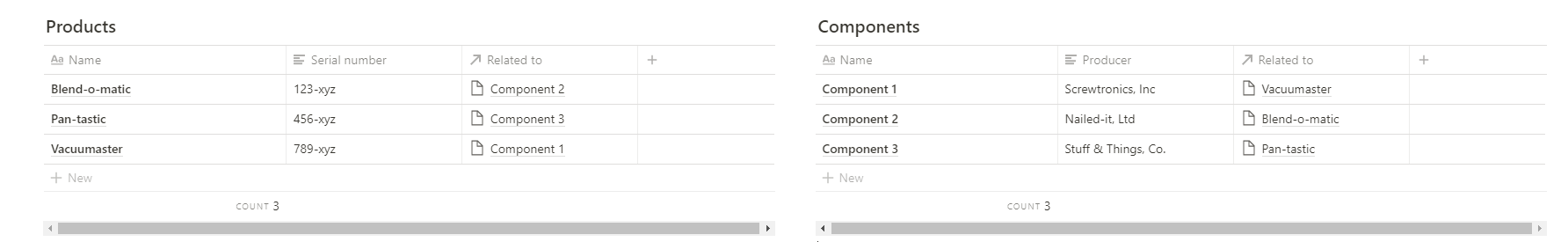
Two related tables. Only items from the Name column in the Products table show up in the Related to column of the Components table, but what if you wanted values from the Serial number column to show up instead?
When you create a new database, by default it will have a column of type title called Name. You can rename that column if you like, but that’s your display column and you can’t change it to one of a different type. That sucks, because sometimes, when you relate databases to each other, you want other columns than the title column to show up.
4. Auto-generated unique IDs
Columns of type title do not work as unique identifiers for your database records. You can input the exact same text into the title column of each and every row of your database, and that’s fine. You can even leave it empty. In fact, there are no unique ID fields in Notion databases. You can of course add a number column and write your own IDs, but you’ll have to write each and everyone manually. I’d rather have a special column type that automatically numbers each row.
5. Conditional formatting
Notion isn’t a very visual app. As I mentioned before, it only offers few dull colours to choose from, and if you want to change the colour of the elements in your workspace, this can only be done manually. This makes perfect sense for most cases, but in some cases you might want your text to be automatically highlighted in a certain way when a given condition is matched: in other words, you might want conditional formatting. A good example of this is a to-do list where crossed-out items automatically turn green, or a task list where tasks labelled as “high priority” turn blue. (You can do this in Coda.io, for example.) Lack of conditional formatting is hardly a deal breaker, but it does make Notion less visually intuitive and appealing than it could be.
6. Colour picker
Did I mention how bland colours in Notion are? Sorry guys, I love your app, but this is one of my top pet-peeves. I see no good reason why Notion only offers a handful of dull colours when it could allow you to choose your own colours from a colour picker instead. It’s not just about eye candy: I often end up reusing the same colours for different labels, for example, because I have more labels than there are colours. That sucks.
7. More powerful formulas
Notion formulas can only read data from cells within the same row, and you can’t write a different formula for each cell of a formula column. (In this sense, Notion tables are definitely not a replacement for a spreadsheet.) These would be nice features to have, and being able to use formulas to programmatically change cell values would be even nicer. (Though I imagine that this might introduce data validation issues.)
8. Better formula editor
As it is, the formula editor in Notion leaves much to be desired. Syntax is not highlighted (with the exception of property names, because they are included in quotation marks, and logical operators) and neither are errors: if you write something wrong, the formula editor will tell you the error type and… how many characters you need to count from the beginning of the formula in order to find where the error is. God forbid you had a long expression with multiple nested parentheses and you typed one of them wrong.
Also, formulas are typed in a single line, even though it may seem otherwise. It means that if you press up or down trying to navigate your formula (for example to locate an error), you’ll actually navigate the list of properties and functions on the list on the left, which can be quite annoying.
A search box to find a specific function on the function list without having to type it into your formula would also be nice.
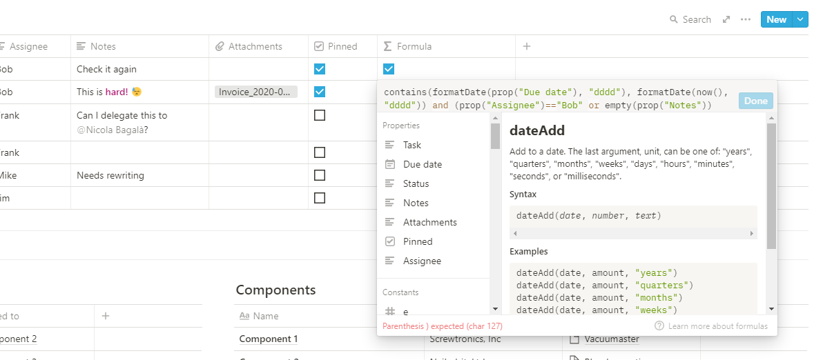
Having to count 127 characters isn’t the best way to go about this.
9. Custom placeholder text
I didn’t mention that you can make entry templates for your databases. If you have a book database, for example, you can make a template for detective stories, one for science fiction, one for romance, and so on, all labelled differently, with a different cover and a different icon, etc.
That’s neat and handy, but it would be even better if you were able to give each of your database fields a custom placeholder text that is displayed as long as the field itself is empty. At the moment, an empty database field displays “Empty” as a placeholder text, and you can’t change that. A placeholder text is normally greyed out and it disappears from the field as soon as you click it; you don’t need to go and delete it yourself.

Notion’s current placeholder text is “Empty” for all blocks that have one.
Custom placeholder text is useful to remind yourself or others about the format of the data to be written in each field; as a silly example, the custom placeholder text for an email field could be “e.g., john@doe.com”.

Custom placeholder texts would allow you to create more personalised databases, like in this mock-up contact list.

Placeholder text disappears automatically when you click it, and reappears if you don’t write anything.
I can see a use case for custom placeholder text even for blocks in a page—for example, if you’re building some kind of form that needs to be filled out.
10. Greyed-out past days
I use the calendar view of my task database to plan my tasks week by week. When I do that, it would be useful to be able to tell at a glance past days from coming ones. Sure, you can look at the numbers, but it would be easier if past days were greyed out, like in Google Calendar.
11. Dynamically sized calendar cards
In Notion, you can configure different database views to show or hide specific fields, which is very useful to create highly customised views. However, if a field is set to visible, it will be visible even if it’s empty. That’s perfectly fine for table views, but it may lead to rather cumbersome and unsightly calendar views. If your entries have five properties and all are set to visible, the cards on the calendar will be sized to accommodate all of them, no matter what. This means that all cards in a calendar row will be as large as a card with all properties filled out needs to be. Smarter cards that don’t display empty fields would make for nicer-looking calendars.
The card titled Task 2, in the bottom-right corner of the picture, has all properties filled out. Other cards don’t, and yet they’re just as large as Task 2 everywhere on the calendar. You could save space on your screen if they were just as large as they actually need to be.
12. Collapsible property lists
A Notion database entry is basically a page with a list of its properties at the top.
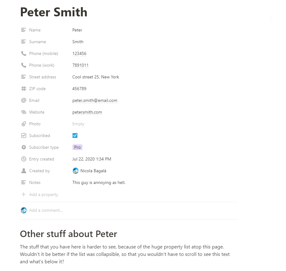
That’s a looong list of properties.
If your database only has a few fields, its entries will have only a few properties listed at the top; but if your database has many fields (like in the picture above), you’re going to have a huge list of properties at the top of your entries, which is inconvenient because it forces you to scroll down to get to the content of the entry and is aesthetically unpleasing. This (minor) issue could be solved if the list of properties atop database entries was collapsible—bonus points if you could move the list somewhere else than the top of the page, but that’s far from an essential improvement.
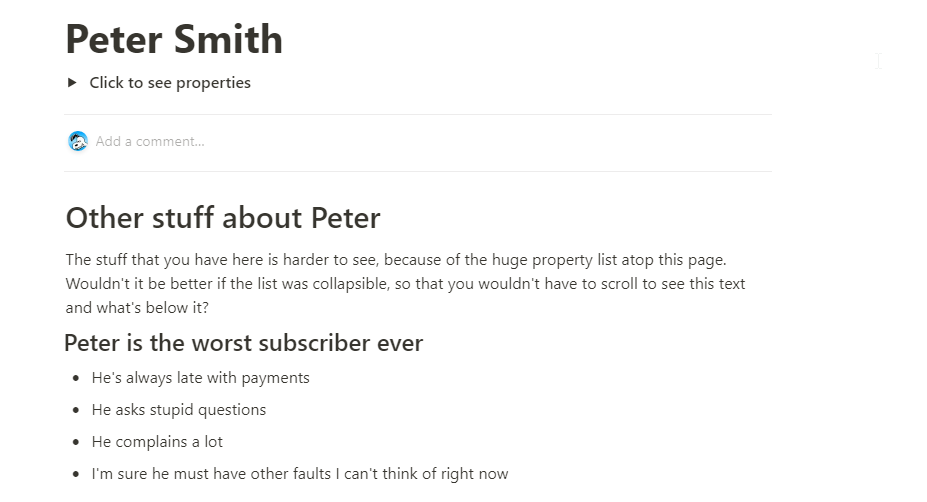
This is what a collapsed property list could look like. You can see the rest of the page without scrolling.

The expanded list of properties would look the same as before, just with a toggle or some other control to collapse it when necessary.
13. Field drag-and-drop
Sometimes, when you have two database fields of the same type, you end up entering your data in the wrong one. To correct that, what I do is I cut and paste the data in the right field, but that’s kind of slow. To speed things up, it would be really cool if you could drag and drop data across fields of the same type. (If both fields contain data, I suppose this might still be done by swapping the data between them.)
14. Additional block types
I can think of a few situations where radio buttons and dropdowns could be useful in Notion. For example, to specify further information without adding yet another column to your database (dropdown), or to hide or grey out a group of other blocks that aren’t needed in that specific situation (radio button).
As said, I use Notion to keep track of all the steps involved in producing my YouTube videos. My template task list for video production looks like this:

All videos have a description, but only some of them have such a long list of sources and further reading material to warrant a separate document for them. A radio button would allow me and my team to quickly hide or grey out the Sources and further reading section when it’s not needed, without having to resort to messy workarounds (such as creating a separate template without that section) or to mentally keep track of which episodes have a separate document for sources and which don’t.

The Writing section of my video production task list, equipped with a (photoshopped) radio button block. On the left, the Sources and further reading section is enabled; on the right, it’s greyed out.
Of course, this feature wouldn’t just require the introduction of a radio button block; to do something like that, you’d need the ability to group blocks and associate a group of blocks to a pair of radio buttons (though in the example I mentioned, a single checkbox would be enough). That kind of already exists in Notion, because you can nest blocks under another block (either by drag-and-drop or by pressing tab when the block to be nested is selected).
It’s true that, at least in this example, you could accomplish virtually the same thing by placing the entire Sources and further reading section inside a toggle block and expand it/collapse it depending on whether there’s a separate document for sources or not, but I think the radio button/checkbox solution is clearer and more elegant.
15. More visible comments
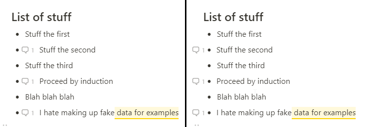
In Notion, you can comment a piece of text as well as an entire block. When you comment part of a text, the commented bit is clearly highlighted, but if you comment the entire block, your only way to notice the comment is a tiny icon, often far away from the content of the block. Sometimes the icon is so far away that it’s hard to tell which block it refers to.
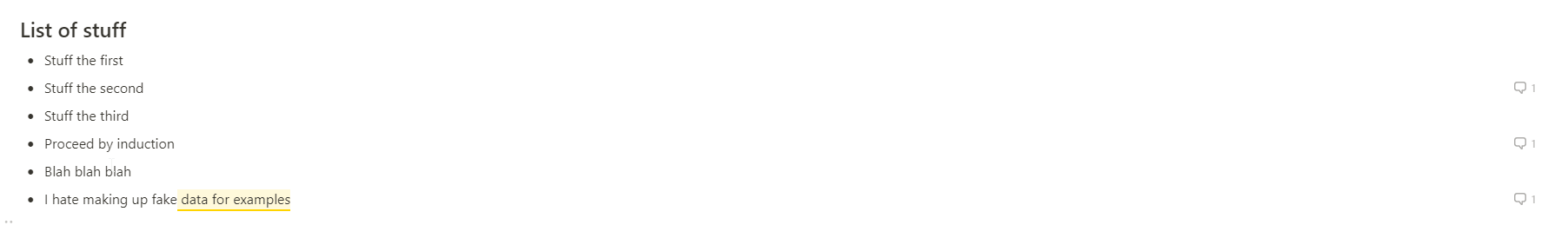
Comment icons in Notion. It’s not very easy to tell at a glance which comment belongs to what item on the list.
Ways to improve that would be to move the comment icon to the beginning of the block, or highlight commented blocks with a different colour (or both).
My proposed solutions to improve comments. The comment icon could be moved to the very beginning of a block, either after or before the bullet/checkbox (if any).
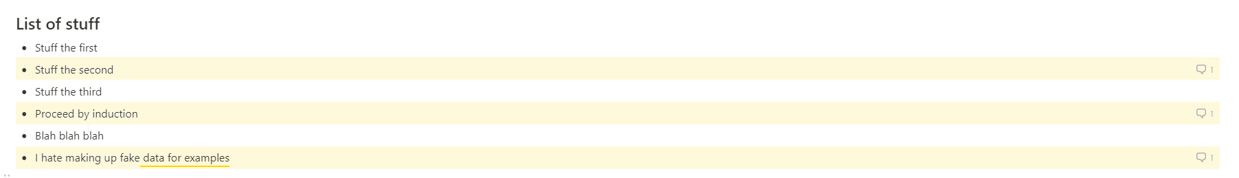
Commented blocks could also be automatically highlighted. You can tell right away which comment belongs to which item.
You could highlight commented blocks manually (by changing their background colour) but that’s an annoying extra step that could be automatically done by Notion for you.
The pitfalls of productivity tools
Using productivity tools like Notion is not without perils. The worst is probably the temptation to over-organise things. When you are given many options, you might be tempted to find a use for each of them. I know this happens to me, and that’s how I sometimes end up with too many properties in my tables, too many blocks on my pages, and a structure that’s just too granular. When that happens, either of two scenarios follows: I do more work than necessary to tick all the boxes and fill out all the fields until I finally grow tired of it and rework my page structure, or my pages drag around for a while a cumbersome structure that I never use, until, again, I grow tired of it and rebuild it from scratch.

Another pitfall of too many options is the time you invest in figuring out how to put them into use. For some, Notion’s blank pages might be panic-inducing: you’re given an entirely empty space and a lot of stuff you could fill it up with. How to best structure and organise your workspace? What should your pages and tables look like? Should you add one more property to capture this teeny tiny nuance? How about another view? After all, visualising your tasks as a kanban board organised by priority, status, assignee, due date, etcetera, is more comprehensive than just a list of checkboxes.
I’ve been there. It’s pretty much an instance of analysis paralysis, and I don’t think it’s to be blamed on the tools per se. It’s good to have many options; you just need to learn what you need and when, and resist the temptation to add that one more property or that one more table if you suspect that you don’t really need it. If you can get past that phase, Notion (or other tools like it) can be extremely useful. (This comes from a guy who, when he was a child with a new backpack, he just needed to assign a job to every last pocket, even if it meant carrying around useless stuff. I still kind of feel that urge, sometimes.)
Finding a use for every block type in your tool of choice isn’t the only situation where you might be paralysed by too many options to choose from. The choice of the tool itself may put you in such a predicament.
Have you noticed how fucking many productivity apps there are out there? I have. I like reading app reviews from time to time, and nearly each time I discover at least one or two new apps I didn’t know. The temptation to check them out is too big, so I do, and while I don’t end up with dozens of new productivity app accounts, I confess that I do hear a tiny voice whispering in my head: “Look how shiny and colourful it is! Doesn’t the demo look super cool? Imagine how much more efficiently you could organise your work with such a slick interface!” While I’ve learned not to listen to the tiny voice of doom, I still have a few of those apps saved in my bookmarks. Just in case.
Shiny tools and promises of productivity are addictive, for some reason. Part of it might be the human need for novelty and change: I get bored of my workspace every so often, and I end up reorganising it once more, or even scouting for new tools to use. My current Notion setup has been fairly stable for a while, and I really don’t see myself changing it or moving to a different tool anytime soon (especially if some of the things on my wish list get implemented, wink wink), but this kind of temptation still exists. On the plus side, I guess this pushes app developers to constantly look for features to add to keep their users engaged, which has the effect of reducing the chances of meandering away towards new tools. 😛
